

ID 3012, Spring 2008
Overview
This was a short (two-week) assignment that introduced the class into designing a product family. The basic task was simple: design a place setting consisting of a cup, plate, and saucer. The design had to be based off a set of three key words and the three pieces had to work together as a product family.
Key Words
Technology
new forms
the future is now
Modernity
refined yet practical
daily use, yet not cheap
Abstraction
avoids blatant images (i.e. circuitry)
conveys ideas without relying on source material
Design
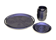
A series of concept sketches led to a set of 5 distinct styles. The design I chose to proceed with was inspired by the Star Trek LCARS computer interface designed by Michael Okuda. Early on I decided to manufacture the plates out of glass to allow for a multilayered effect, so my sketch development was greatly assisted with 3D modeling, first with Form-Z and later with SolidWorks.

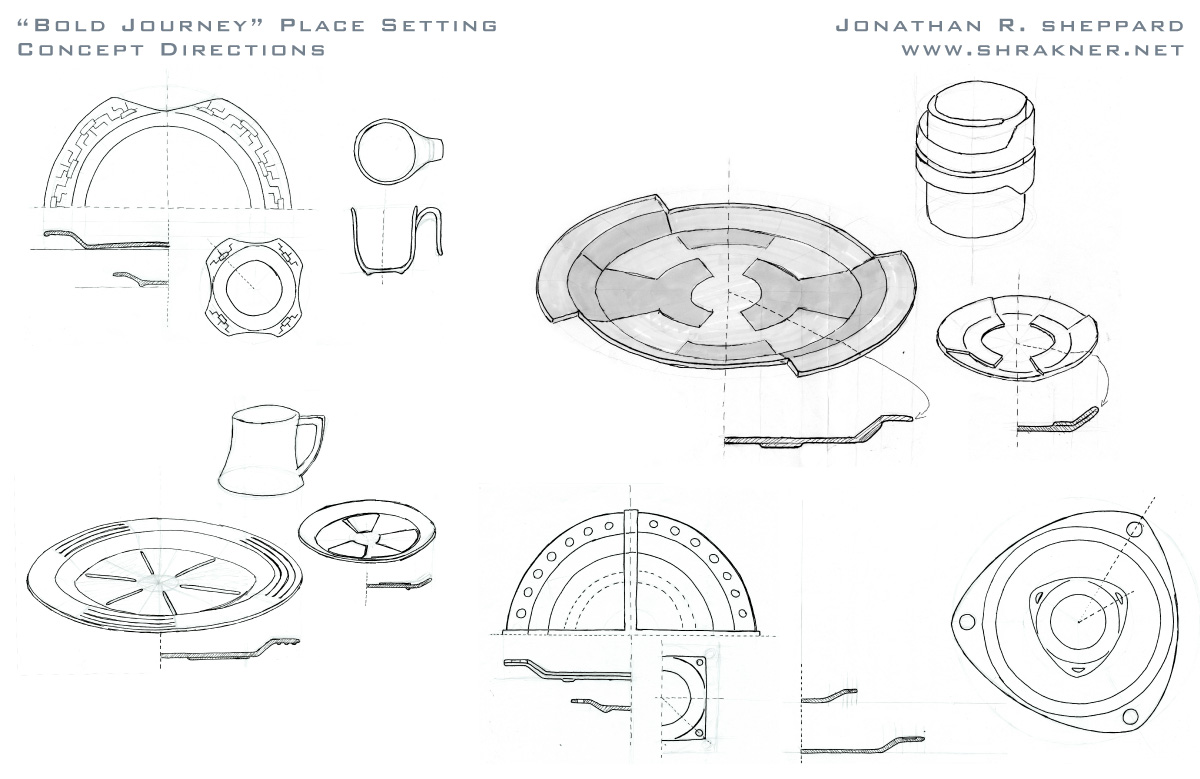
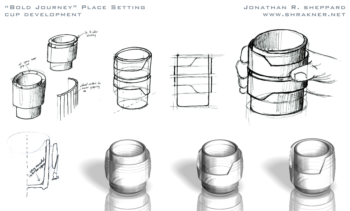

The cup design was one of the earliest inspirations of the project. In keeping with the "new forms" aspect of technology that I stated earlier, I wanted a distinctive cup design. As the cup was required to hold hot liquid, most people gave it a variant of the conventional handle in order to protect the user's hand from heat. My design draws its primary inspiration instead from an insulated cup, which uses a layer of air to protect the hand from heat. The functionality is exposed with a gripping layer of glass on the exterior, held away from the main body by several ribs. This creates an airflow region which helps keep the grip cool. A portion of the gripping area is cut away to allow clear access for lips to rest agains the inner body of the cup for more comfortable drinking.
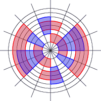
The final plate design utilized a two-layer pattern (shown on the right) for the main glass plate. Red denotes the raised areas on the underside of the plate, while the blue regions are textured and slightly recessed into the top surface. The slots on the plate rim were inspired by a fortuitous mistake in Form-Z and were carefully modified to be strong and durable.
The saucer was designed to be an intermediary between the plate and cup interms of style. To transition to the plainer style of the cup, it features a less complex pattern than the plate. Both the top and bottom pattern layers are raised glass, creating an affordance that allows the cup to interface with the saucer. Although derived from the slots in the plate, the segmented rim of the saucer serves a unique purpose: to hold a spoon laid down on it without letting it slide off.
Color Studies
To verify my original intent to use clear glass, I did two other color studies. The gloss black showed the dependency of my design on its transparent nature. Though the iridescent blue would work well with the overall theme, it would severely overpower the food and drink it is meant to serve.
 |
 |
 |
| Clear glass | Gloss black ceramic | Iridescent blue |
Final Renderings
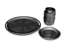
All illustrations on this page were modeled with SolidWorks and rendered in PhotoWorks. This is the first time I have used SolidWorks on a design project, and I am fairly satisfied with the result. However, I have been experimenting with rendering glass better, as it looks rather metallic in some places.

A complete set (6 each) of my cup, plate, and saucer.
All site layout, graphics, and content © 2007 Jonathan Sheppard. Contact: shrakner2140@yahoo.com
This site is best viewed with Firefox or Safari.

